#13 Introducing, The NOA Prize Winner
A winner, a runner up, and lots of special mentions.
The end is nigh. The long and winding road of the inaugural NOA Prize is over.
So many remarkable entries, so many striking innovations.
From 3D printed stamps and maker mark revivalism to ingenious reimaginings of heraldry and some fantastically ornate drawings — the standard has been truly exceptional.
Each submission was shot through with thought, meaning, lore, craft, and — dare I say — love!
This is a blessing and a curse.
The process of selecting a winner has been deeply painful. I simply did not conceive that there would be so many excellent entries.
Back in March, I thought I would receive a few simple sketches, and an obvious winner…
How wrong I was!
Every single submission is beautiful in its own special way.
Yet, there can only be one winner.
It gives me great pleasure to announce the winner and runner-up of the NOA Prize.
Winners — Angel Jones & Tom Moore
Angel and Tom are true artists — and masters of ink. Their hand-drawn designs combine a selection of beautifully sculpted word and letter marks with some striking unicorn and dragon mascots (the first of many!) that delicately balance the brief’s stated desire for rootedness with an elegantly visionary dream of the future.
In Tom & Angel’s own words:
“For us, there's a hierarchy in a design journey, and it all needs to start with the primary logo, and trickle down through the rest, much like a river to an ocean. So, many of the concepts have been kept open, and we've defined more of the starting point. After reading the brief, we spent a long time considering how to capture 'Britain' in a mark, in it's simplest form (whilst drinking too much coffee). For us, there were some clear definitions that were consolidated: soulfully rooted lent towards natural imagery, and there was something in 'elegantly visionary' that sung towards myth. As a studio, the myth and legends within British folklore are a huge influence, and many of them feature in marks that are most prominent across Britain. We whittled these down to two marks that are full of story and will spark patrons imaginations: the dragon and the unicorn. We love that they're mascots too - which will be really versatile across submarks and other illustrations. There's a world of possibility in moving these marks towards a 3D stamp too, and numerous directions we can build them in. We wanted marks that could be balanced and refined in a direction that could feel more friendly or more punk too - and both mascots could be wildly maverick if chosen to be.”
Congratulations Tom & Angel — I look forward to meeting!
Runner Up — Eve Johnston
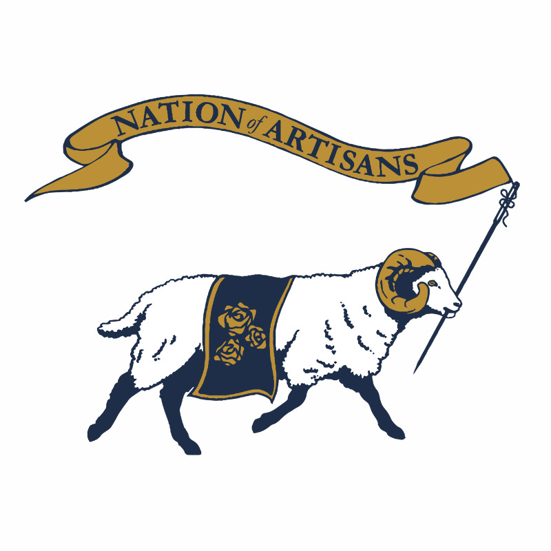
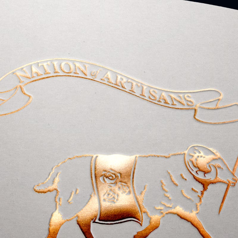
Eve’s design is a personal and fan favourite. This is a ram that means business — he’s on a mission and he’s waving the flag. A beautiful concept, delightfully executed.
In Eve’s own words:
"I wanted to illustrate something based on nature with a nod to craftsmanship and English heritage per the guidelines. I found plenty of inspiration in Burberry and St. JOHN; still, I noticed throughout Nation of Artisans' imagery that sheep were often used. Despite Louis expressing that this choice is purely from liking the animal, I found it hard to ignore the symbolism of the English ram. I illustrated the animal for this logo as it represents resilience, power and nature. He’s running forward to depict innovation and progression."
I love this flag wielding ram.
Special Mentions
Most Adorable Animal — Rohan
I adore this little lamb.
Most Innovative Animal — Callum Dawes
I find Callum’s unicorn-dragon-lion deeply hypnotic. A wonderful idea, brilliantly executed.
Methodological Innovation — Charley Orr
Charley 3D printed a set of custom stamps to develop his distinctive maker mark. Beautiful and visionary.
Heritage Futurist Visionary — Abishaq Paul Leel
Abishaq’s design is a perfect encapsulation of what I call Heritage Futurism. From the font (of Faculty AI fame) to the subtly integrated Union Jack and the 15 stars (a reference to my 15 Dreams of Britain), it’s a captivating piece of work.
Best Drawing — Doa Centelles
Doa is an exceptional artist. I love this drawing.
The People’s Winner — Josh Shepherd Smith
Need I say more. Of course, this one couldn’t win. Yet, it’s the finest encapsulation of what Nation of Artisans is truly about.
The NOA Prize may be over, but the journey of shaping Nation of Artisan’s visual identity is still in its infancy.
In the mean time — I want to thank everyone who submitted from the bottom of my heart. The work is fantastic. I’ve spent the last few weeks scrolling through all of them and each on brings a pang of joy to my heart. When my website is ready, I am going to devote a whole section showcases the magic of each design — a pantheon of NOA!
Thank you.
Until next time.


